The Dashboard Turnaround
Enterprise SaaS
Design Principles
Cross-Functional
The Dashboard Turnaround
Enterprise SaaS
Design Principles
Cross-Functional
The Dashboard Turnaround
Enterprise SaaS
Design Principles
Cross-Functional
Summary
MISSION
MISSION
Iru needed a dashboard that gave administrators a clear, actionable view of their entire device management ecosystem across endpoint security, compliance, identity, and vulnerabilities. The dashboard was supposed to be that place. It wasn't working.
Iru needed a dashboard that gave administrators a clear, actionable view of their entire device management ecosystem across endpoint security, compliance, identity, and vulnerabilities. The dashboard was supposed to be that place. It wasn't working.
CHALLENGE
CHALLENGE
The previous team had built a version focused on AI features not on what a dashboard actually needs to do. Users landed on it and left immediately. Pendo showed 0% interaction. I was brought in with one quarter to fix it, using only existing components, with no additional engineering resources for new UI work. The constraint wasn't just time, it was that every decision had to work within what already existed.
The previous team had built a version focused on AI features not on what a dashboard actually needs to do. Users landed on it and left immediately. Pendo showed 0% interaction. I was brought in with one quarter to fix it, using only existing components, with no additional engineering resources for new UI work. The constraint wasn't just time, it was that every decision had to work within what already existed.
MY CONTRIBUTION
MY CONTRIBUTION
I audited the existing design for every UX and visual problem, ran competitive benchmarking across 7 dashboard references, conducted with my PM detailed conversations with cross-departmental stakeholders and clients to understand what information actually mattered, and redesigned the entire dashboard within the existing custom component the previous team used. I also defined a true responsive breakpoint system, a gap in the design foundation that no one had addressed which the incoming VP of Design is now backing as a platform-wide standard.
I audited the existing design for every UX and visual problem, ran competitive benchmarking across 7 dashboard references, conducted with my PM detailed conversations with cross-departmental stakeholders and clients to understand what information actually mattered, and redesigned the entire dashboard within the existing custom component the previous team used. I also defined a true responsive breakpoint system, a gap in the design foundation that no one had addressed which the incoming VP of Design is now backing as a platform-wide standard.
CLIENT & ROLE
CLIENT & ROLE
Iru
Company
Coral Gables, FL
Location
2024 - Present
Duration
Sr. Product Designer
Role
Figma / Claude Cursor / Storybook
Tools
Enterprise dashboard redesign
Service
KEY OUTCOME
KEY OUTCOME
47% increase in dashboard interaction at launch. 62% and growing as of the most recent Pendo pull. Leadership is now using this data to propose the dashboard as the platform's primary homepage, a product strategy decision driven by design evidence and user behavior.
47% increase in dashboard interaction at launch. 62% and growing as of the most recent Pendo pull. Leadership is now using this data to propose the dashboard as the platform's primary homepage, a product strategy decision driven by design evidence and user behavior.
0%
0%
Interaction rate when handed over to me
Interaction rate when handover to me
62%
62%
Engagement increase and still growing
Engagement increase and still growing
1 Qtr
1 Qtr
Timeline to redesign with existing components only
Timeline to redesign with existing components only
$18M
$18M
Leadership proposing dashboard as homepage
Leadership proposing dashboard as homepage
Starting point
Starting point
DISCOVERY
DISCOVERY
Before touching Figma I needed to understand exactly why the existing dashboard had failed. Pendo data told the what, 0% interaction, immediate drop-off. I needed to understand the why. I ran a full audit of the AI team's version and identified six distinct failure categories that were compounding on each other.
Before touching Figma I needed to understand exactly why the existing dashboard had failed. Pendo data told the what, 0% interaction, immediate drop-off. I needed to understand the why. I ran a full audit of the AI team's version and identified six distinct failure categories that were compounding on each other.
Typography chaos
10+ type sizes and weights in use with no hierarchy logic. Users couldn't scan the page because nothing had visual priority.
Color overload
Too many colors competing for attention. No semantic meaning. Everything felt equally important, which meant nothing was.
Grid only worked for one view
The layout was designed for a single filled state. Empty state, single-product state, and multi-product state all broke.
Grid only worked for one view
The layout was designed for a single filled state. Empty state, single-product state, and multi-product state all broke.
Purposeless empty states
Empty states were placeholders with no UX intent. No upsell opportunity, no onboarding direction, no next action for the user.
Purposeless empty states
Empty states were placeholders with no UX intent. No upsell opportunity, no onboarding direction, no next action for the user.
Wrong information
The data shown was chosen by the previous team without solid input from other departments or clients. It didn't reflect what was needed.
Nothing was interactive
Except for AI features, nothing was clickable or actionable. Important operational data had no drill-down path. The dashboard was a dead end.
Insight: "The previous team built a dashboard for their features. I needed to build a dashboard for the people using the product. Those are two completely different briefs."
Insight: Fixed income wasn’t inaccessible because of the financial product, it was inaccessible because of the experience layer.
This reframed our ambition: design a modern operating system for fixed-income portfolio construction.
PLANNING
PLANNING
I was given Stripe as a reference point. I expanded that to seven benchmarks, covering the provided reference, structural layout, visual language, and out-of-the-box Shadcn patterns. The goal was to avoid being anchored to a single reference and to understand the full range of what a dashboard at this complexity level could be. From the benchmarks, I extracted three principles that would guide every decision: hierarchy before data, interaction over display, and system-wide consistency.
I was provided Stripe as a reference point. I expanded that to 7 benchmark, covering provided reference, structural layout, visual language, and out-of-the-box Shadcn patterns. The goal was to avoid being anchored to a single reference and to understand the full range of what a dashboard at this complexity level could be. From the benchmarks I extracted three principles that would guide every decision: hierarchy before data, interaction over display, and system-wide consistency.
BENCHMARKS
BENCHMARKS

RESEARCH
RESEARCH
Before designing a single component I spent time in detailed conversations with every department that had a stake in what the dashboard showed and with clients directly. This surfaced data needs that the previous team had never considered: compliance status across frameworks, vulnerability severity by OS, active user counts relative to licensed seats, and device check-in health. The dashboard that shipped reflects those conversations, not assumptions.
Before designing a single component I spent time in detailed conversations with every department that had a stake in what the dashboard showed and with clients directly. This surfaced data needs that the previous team had never considered: compliance status across frameworks, vulnerability severity by OS, active user counts relative to licensed seats, and device check-in health. The dashboard that shipped reflects those conversations, not assumptions.
PREVIOUS ATTEMPT
PREVIOUS ATTEMPT

Redesign first round
Redesign first round
CONSTRAINTS
CONSTRAINTS
One quarter. Existing components only. No new engineering resources for UI work. These weren’t just limitations; they became the design principle. Every decision had to be achievable within what already existed in the Shadcn-based design system. This forced a kind of discipline that’s actually rare: instead of designing the ideal and hoping engineering could build it, I had to deeply understand what we already had and find the highest-leverage ways to recombine it.
One quarter. Existing components only. No new engineering resources for UI work. These weren’t just limitations; they became the design principle. Every decision had to be achievable within what already existed in the Shadcn-based design system. This forced a kind of discipline that’s actually rare: instead of designing the ideal and hoping engineering could build it, I had to deeply understand what we already had and find the highest-leverage ways to recombine it.
FIRST OUTCOME
FIRST OUTCOME

Responsive
Responsive
During the redesign I identified a foundational gap: Iru had been using Tailwind's default breakpoints, which weren't calibrated for our actual product viewport distribution. I proposed and designed Iru's first custom breakpoint system; Mobile (393px), Tablet (1024px), Desktop (1280px), Large Desktop (1520px), Wide Screen (2560px) with defined card min/max widths to ensure consistent layout behavior across all screen sizes. This work is now being backed by the incoming VP of Design as a platform-wide standard.
During the redesign I identified a foundational gap: Iru had been using Tailwind's default breakpoints, which weren't calibrated for our actual product viewport distribution. I proposed and designed Iru's first custom breakpoint system; Mobile (393px), Tablet (1024px), Desktop (1280px), Large Desktop (1520px), Wide Screen (2560px) with defined card min/max widths to ensure consistent layout behavior across all screen sizes. This work is now being backed by the incoming VP of Design as a platform-wide standard.
What shipped
What shipped
outcome
outcome
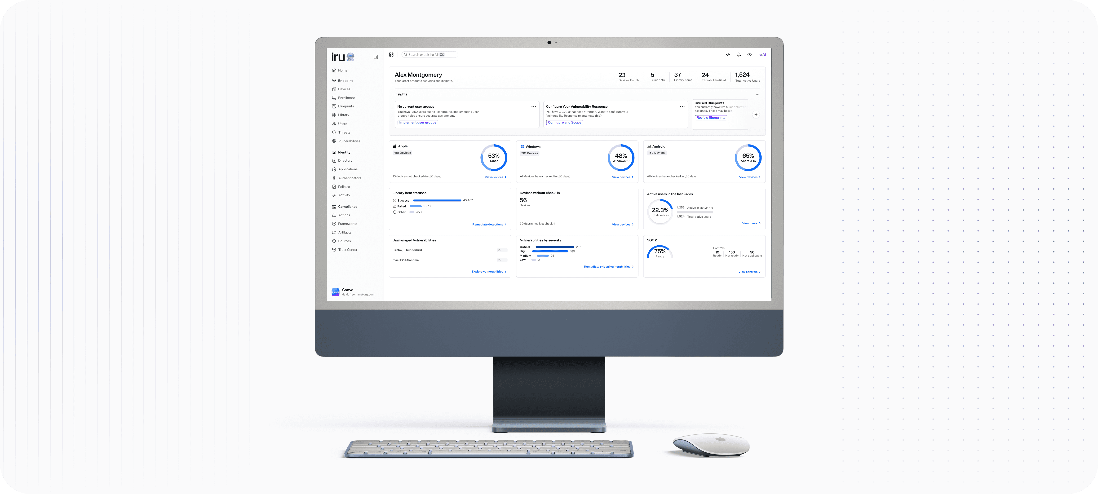
The shipped dashboard surfaces what Iru administrators need at a glance: device health, vulnerability severity, compliance readiness, and active user counts across the fleet. Every widget is interactive, and every number links to its source. The insights panel surfaces AI-assisted recommendations without making AI the point of the page.
The before/after contrast tells the story more clearly than any copy could: the AI team’s version had a 0% interaction rate. The redesigned version has a 62% engagement increase and is actively being discussed as the platform’s new homepage.
Split into two sentences: The shipped dashboard surfaces what Iru administrators actually need at a glance, device health, vulnerability severity, compliance readiness, and active user counts across every fleet. Every widget is interactive. Every number links to its source. Every widget is interactive. Every number links to its source. The insights panel surfaces AI-assisted recommended actions without making AI the point of the page.
The before/after contrast tells the story more clearly than any copy could: the AI team's version had a 0% interaction rate. The redesigned version has a 62% engagement increase and is actively being discussed as the platform's new homepage.
Before - Previous team attempt
10+ type sizes · color overload · non-interactive · single-view grid · purposeless empty states · 0% interaction rate
Release - Post feedback & approvals
3 sizes · 2 weights · monochromatic · fully interactive · multi-state grid · purposeful empty states · 62% engagement increase
FINAL OUTCOME
FINAL OUTCOME

What’s next
What’s next
DIRECTION
DIRECTION
V2 introduced dashboard customization: administrators can now adjust widget layout and content to their specific fleet priorities. This phase was built using Iru’s in-house AI toolkit, a workflow connecting Figma and Mobbin through Claude and Cursor to a GitHub branch tied directly to our Storybook component library. It’s not a direct engineering handoff; the code isn’t production-ready, but it gives developers all interaction patterns, sizing, and component references with no guesswork, significantly accelerating frontend implementation. V3 is in active brainstorming. The direction: an AI-assisted homepage that feels more like a to-do list than a data dashboard, surfacing the most critical actions for each administrator based on their fleet’s current state. The 62% engagement data is the business case. The design direction is already in motion.
V2 introduced dashboard customization administrators can now adjust widget layout and content to their specific fleet priorities. This phase was built using Iru's in-house AI toolkit: a workflow connecting Figma and Mobbin through Claude and Cursor to a GitHub branch tied directly to our Storybook component library. It's not a direct engineering handoff, the code isn't production-ready but it gives developers all interaction patterns, sizing, and component references with no guesswork, accelerating frontend implementation significantly.
V3 is in active brainstorm. The direction: an AI-assisted homepage that feels more like a todo list than a data dashboard surfacing the most critical actions for each administrator based on their fleet's current state. The 62% engagement data is the business case. The design direction is already in motion.
AI TOOLKIT
AI TOOL KIT
The AI toolkit workflow, Figma/Mobbin → Claude/Cursor → GitHub branch → Storybook — came out of this project and is now being used across the team. A strong design system foundation makes better AI tools for frontend work. This project proved it.
The AI toolkit workflow, Figma/Mobbin → Claude/Cursor → GitHub branch → Storybook — came out of this project and is now being used across the team. A strong design system foundation makes better AI tools for frontend work. This project proved it.
TOOLKIT EXAMPLE
TOOLKIT EXAMPLE
REFLECTION
REFLECTION
The most interesting thing about this project isn't the 62% number. It's that the constraint was the design. Working within an existing component library forced a level of clarity and discipline that a blank-canvas redesign never would have required. Every improvement had to come from better decisions, not new UI. Typography, color, hierarchy, interaction, information architecture, that's it. That's the whole toolkit. It turned out to be enough.
The breakpoint system I built alongside this project is still in progress but it's moving. A strong foundation makes everything built on top of it better. That's as true for design systems as it is for dashboards.
The most interesting thing about this project isn't the 62% number. It's that the constraint was the design. Working within an existing component library forced a level of clarity and discipline that a blank-canvas redesign never would have required. Every improvement had to come from better decisions, not new UI. Typography, color, hierarchy, interaction, information architecture, that's it. That's the whole toolkit. It turned out to be enough.
The breakpoint system I built alongside this project is still in progress but it's moving. A strong foundation makes everything built on top of it better. That's as true for design systems as it is for dashboards.